GEX Field
GEX Field is an educational and informational tool. It is not financial advice, and it is not a trading signal service.
Everything on this dashboard exists to help you learn to read options-market positioning — gamma exposure, vanna, and dark pool activity — so you can understand what dealer hedging flow looks like right now. That's the entire purpose of this platform.
GEX Field does not tell you what to buy, what to sell, or when to do it. Nothing displayed here — no level, no color, no label — is a recommendation, a signal, or an endorsement of any trade, position, or strategy. We do not provide personalized investment advice, and nothing on this site should be interpreted as such.
Trading and investing involve real risk of loss. Gamma exposure and vanna describe current options positioning — they are not predictions, and past patterns do not guarantee future price behavior. Market data may also be delayed, incomplete, or contain errors; always verify independently before relying on it.
You are solely responsible for your own investment and trading decisions. GEX Field, its creators, and its operators are not licensed financial advisors, broker-dealers, or investment advisers. Please consult a licensed financial professional before acting on anything you see on this platform.
Color Legend — GEX Levels & Trail
The two color systems you'll see most on every chart, side by side, so you never have to guess what a color means mid-session. Full explanations of what GEX actually is live further down in Understanding GEX and GEX Trail — this is the quick-reference version.
GEX Levels (the dotted lines on your chart, right now)
These are the strike-price lines drawn directly on the main chart, and the matching rows in the GEX data grid.
| Color | Meaning | Explanation |
|---|---|---|
| Green — Positive GEX | A strike above price where dealers are net long gamma. To stay hedged, they sell into rallies and buy into dips — a stabilizing, volatility-dampening flow. The strike with the largest positive GEX above price is the Call Wall, and tends to act like a ceiling. | |
| Red — Negative GEX | A strike below price where dealers are net short gamma. To stay hedged, they buy into rallies and sell into dips — the opposite effect, which can amplify a move rather than calm it. The strike with the largest negative GEX below price is the Put Wall, and tends to act like a floor (though a genuine breakdown through it can accelerate). | |
| Blue — Biggest Node | A solid (not dotted) line marking the single largest gamma concentration currently in view, positive or negative. This is the strike GEX Trail tracks over time (see below) and the level most scanners in this app refer to as the "blue node." |
GEX Trail (Bands / Bubbles)
Trail's colors track the SAME strike's gamma sign over time, one horizontal band (or row of dots in Bubbles mode) per strike — see GEX Trail for the full explanation of how the history itself works.
| Color | Meaning | Explanation |
|---|---|---|
| Emerald — Positive GEX | This strike's gamma exposure was positive at that point in the session. Deliberately a different shade than the candle body green, so a glance can tell "this pixel is the Trail ribbon" from "this pixel is a candle" even where they overlap. | |
| Brick Red — Negative GEX | This strike's gamma exposure was negative at that point in the session. Same reasoning as emerald above — a distinct shade from the candle body red. | |
| Fluorescent Purple — Biggest Node | This strike held the single largest |GEX| of any strike at that exact snapshot — the same "blue node" concept as the solid blue line above, but shown per-moment across Trail's whole history instead of just right now. Overrides emerald/red regardless of sign. A strike that stays purple for a long, unbroken stretch is a genuinely persistent, dealer-defended level; one that only just took the title, or keeps trading it back and forth with a neighbor, is closer to noise. | |
| size | Band Thickness / Dot Size | Not a separate color — this is magnitude. A thicker band (or bigger dot) means a larger absolute gamma exposure at that strike at that moment; thinner/smaller means less. |
Welcome to GEX Field
GEX Field puts live options-market data — gamma exposure (GEX), vanna, and dark pool prints — directly on a price chart, so you can see where dealer hedging activity clusters around the current price. This guide walks through every part of the dashboard, and spends extra time on the two concepts that matter most: GEX and vanna.
Everything on this dashboard is descriptive. It shows you what the options market is doing right now — it does not predict what price will do next, and nothing here is trade advice. Treat every level as context to fold into your own thinking, not a signal to act on by itself.
The Main Chart — A Tour
Here's the main dashboard with its key areas numbered. The table below explains each one.
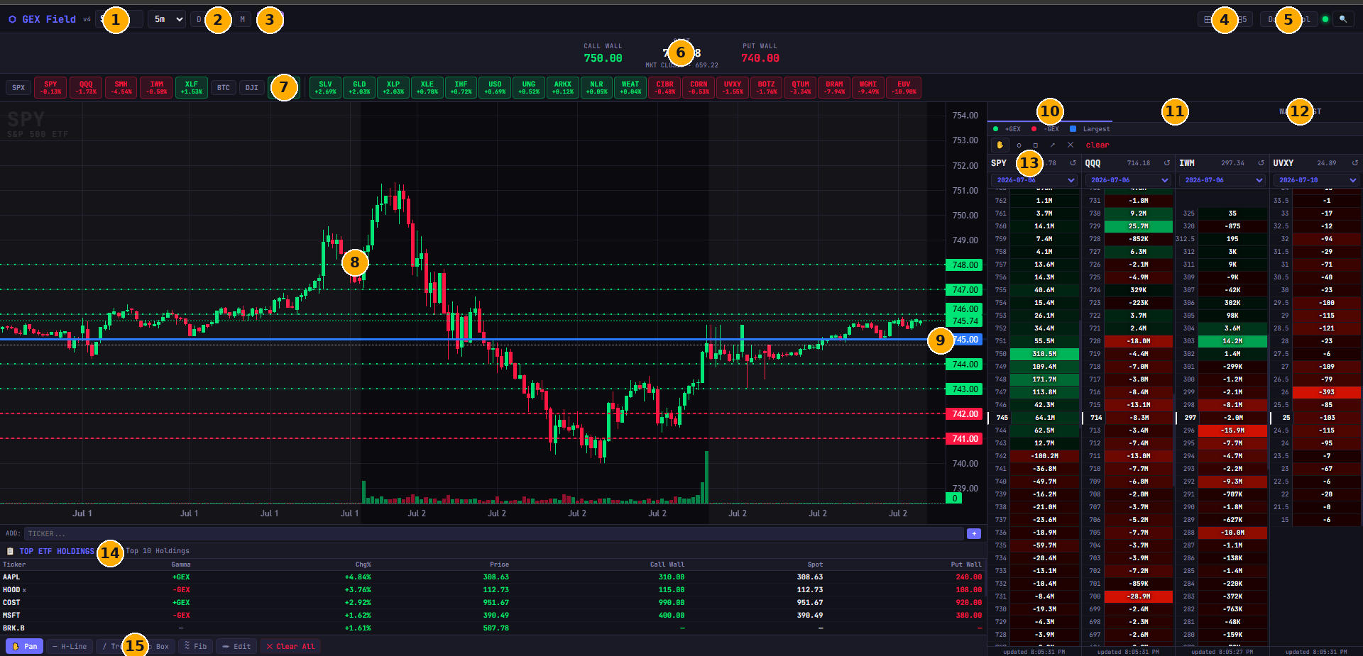
| # | Feature | What it does |
|---|---|---|
| 1 | Ticker Symbol | Type any stock, ETF, or index ticker here and press Enter to load its chart, GEX levels, and options data. |
| 2 | Timeframe Selector | Switch between intraday candles (1m–4h via the dropdown) or Daily / Weekly / Monthly views. |
| 3 | EXT (Extended Hours) | Toggle on to include pre-market and after-hours candles. When on, those stretches of the chart are shaded gray so you can tell them apart from regular trading hours at a glance. |
| 4 | Multi-Chart View | Open a 3-panel or 5-panel grid to watch several tickers side by side, each with its own GEX levels and Dark Pool toggle. Panels can be arranged horizontally or vertically. |
| 5 | Dark Pool Toggle | Turns on/off the display of large off-exchange block trades. |
| 6 | Call Wall / Spot / Put Wall | The three headline numbers: the nearest major +GEX strike above price (Call Wall), the current price (Spot), and the nearest major −GEX strike below price (Put Wall). |
| 7 | Sector Performance Bar | A quick scan of major sector ETFs and indices and their day's percentage move. The first several tickers (major indices like SPX, SPY, QQQ) are always pinned in a fixed order; everything after that is sorted automatically, from the day's best performer down to its worst. |
| 8 | GEX Levels (dotted lines) | Green dotted lines mark strikes with positive gamma exposure above price; red dotted lines mark negative gamma exposure below price. The solid blue line marks the single largest gamma node currently in view. |
| 9 | Spot Price Line | The solid, brighter line with the diamond marker — this is the live, continuously-updating current price. |
| 10 | GEX Tab | Shows the gamma exposure grid — a per-strike table of dollar gamma for the ticker(s) you're watching. |
| 11 | VANNA Tab | Same layout as the GEX tab, but showing vanna exposure by strike instead of gamma exposure. |
| 12 | WATCHLIST Tab | Your personal list of tracked tickers, with live price, gamma regime, and wall levels for each. |
| 13 | GEX Data Grid | The actual per-strike numbers behind the dotted lines on the chart — green cells are positive GEX, red cells are negative GEX, sized/shaded by magnitude. |
| 14 | Top ETF Holdings | When you're viewing a sector ETF, this table shows its largest constituent stocks with their own gamma regime and wall levels. |
| 15 | Drawing Tools | Pan, horizontal line, trend line, box, and Fibonacci retracement tools for annotating the chart, plus Edit, a Hide/Show toggle (hides every drawing at once without deleting them — click again to bring them all back), and Clear All. The same tools are also available as compact icons at the top of the right-hand panel. The Long and Short buttons add a position-planning tool: click your entry price, then click again at your stop-loss to place it. It draws a red risk zone and a green reward zone (sized by a Risk:Reward ratio, 2:1 by default), labels the entry/stop/target prices and the % move to each, and — if you fill in a Risk $ amount when editing it (right-click/long-press the shape) — an approximate share size. The target price isn't dragged directly; adjust the Risk:Reward ratio instead from that same edit panel. |
Understanding GEX (Gamma Exposure)
Start with Gamma
Every option has a Greek called gamma, which measures how fast an option's delta changes as the underlying stock's price moves. Delta tells you how much an option's price moves per $1 move in the stock; gamma tells you how quickly that sensitivity itself is changing.
Options market makers — the firms on the other side of most option trades — don't want to bet on direction. When they sell you a call or a put, they immediately hedge by buying or selling shares of the underlying stock to stay roughly market-neutral. As the stock price moves, gamma forces them to keep adjusting that hedge, buying or selling more stock, over and over, all day.
What GEX Actually Measures
Gamma Exposure (GEX) aggregates the gamma from every outstanding option at every strike price for a stock, and converts it into a dollar figure representing how much stock market makers would need to buy or sell for every $1 move in the underlying — assuming they're hedging their combined position.
The sign matters as much as the size:
Positive GEX at a strike means dealers are, in aggregate, long gamma there. To stay hedged, they sell into rallies and buy into dips — a stabilizing, volatility-dampening flow.
Negative GEX at a strike means dealers are short gamma there. To stay hedged, they buy into rallies and sell into dips — the opposite effect, which can amplify a move rather than calm it.
Call Wall, Put Wall, and the Zero Gamma Flip
Call Wall — the strike with the largest positive GEX above the current price. Dealer hedging flow here tends to act like a ceiling; price often struggles to push through it easily.
Put Wall — the strike with the largest negative GEX below the current price. This level often behaves like a floor, though a genuinely negative-gamma breakdown through it can accelerate rather than bounce.
Zero Gamma (the "flip") — the price level where aggregate dealer gamma crosses from positive to negative. Above the flip, the market tends to be calmer and more range-bound; below it, moves tend to be sharper and faster in both directions.
How GEX Field Shows This
On the chart, dotted green lines mark positive-GEX strikes above price, dotted red lines mark negative-GEX strikes below price, and a solid blue line marks the single largest gamma node currently in view. The GEX tab's data grid shows the actual numbers behind those lines, strike by strike, shaded by magnitude.
One deliberate design choice worth knowing: Call Wall and Put Wall are calculated from strikes reasonably near the current price, not simply "the single largest number anywhere in the entire options chain." A huge gamma concentration at a strike far away — say, a monthly options-expiration date with enormous open interest — usually isn't relevant to how the stock trades today, so it's excluded in favor of whatever's actually influencing near-term price action.
Any strike currently drawn on the chart can also be individually hidden — click that strike's row in the GEX data grid (the one tied to the main chart) to toggle just that one line off, leaving every other level exactly as it was. The row shows strikethrough text and dims when hidden; click it again to bring the line back. Useful for temporarily decluttering a chart with several close-together levels without turning off GEX entirely.
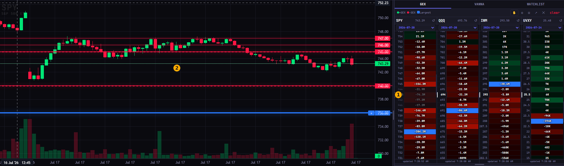
Treat GEX levels as a map of where dealer hedging flow is likely to add friction (positive GEX) or add acceleration (negative GEX) — not as a prediction of which way price will go. A stock can push straight through a call wall on real news; a put wall can break just as easily in a genuine sell-off. GEX describes current positioning, it doesn't override actual supply and demand.
GEX Trail
Every GEX snapshot this app records gets kept, not just the latest one — Trail draws that history directly on the chart as a horizontal ribbon at each strike, so you can see how gamma exposure at that level has actually moved through the session instead of only ever seeing the current instant. Toggle it on with the Trail button in the chart toolbar.
The single strike carrying the largest absolute gamma exposure at any given snapshot — the "blue node" everywhere else in this guide and app — gets highlighted in a distinct fluorescent purple wherever it actually held that title, so the purple stretch of a ribbon shows you exactly when and for how long a level was the dominant one, not just where it is right now.
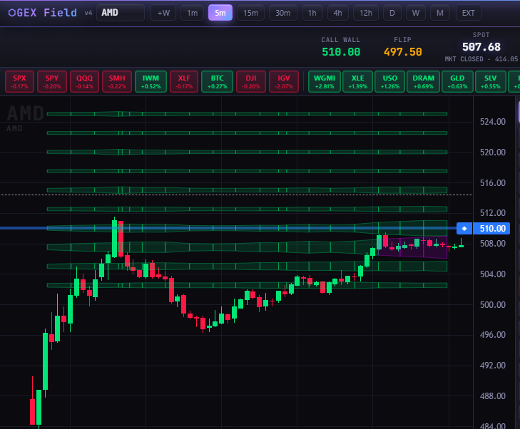
Bands draws a continuous filled ribbon per strike — thicker where that strike's gamma exposure was larger at that point in time, thinner where it was smaller. Bubbles (the button right next to Trail) switches to a discrete dot per snapshot instead of a connected band — same size-by-magnitude encoding, just not stitched into one continuous shape.
A level that's held the purple "biggest node" title for a long, unbroken stretch reads very differently from one that only just took the title a moment ago, or keeps trading it back and forth with a neighboring strike — the first is a genuinely persistent, dealer-defended level; the second is closer to noise. Several scanners elsewhere in this app (Breakout & Retest, Uptrend Entries, Callouts) now check this same history before treating a blue node as real.
Replay
Replay scrubs back through any past recorded trading day, showing the candles as they actually printed and recomputing GEX Trail's ribbon, the Call/Put Wall header, and the GEX grid exactly as they would have looked at that exact point in time — a study tool for reviewing how a session actually developed, not a live feature. Open it from the Replay button in the chart toolbar (or, on mobile, from the account menu), pick a date, and it takes over the chart until you exit.
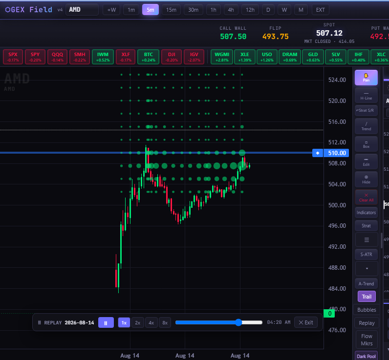
| # | Feature | What it does |
|---|---|---|
| 1 | Play / Pause | Starts or stops automatic playback from the current position. |
| 2 | Speed (1x/2x/4x/8x) | Each is its own button — click straight to the speed you want instead of cycling through them. |
| 3 | Scrub Bar | Drag directly to any point in the session; the chart, Trail ribbon, and GEX grid all jump to match instantly. |
| 4 | Exit | Leaves Replay and hands the chart back to live mode. |
Replay only has history for days it actually recorded — a ticker only starts accumulating snapshots once it's been viewed with Trail turned on, so a ticker or day you never had Trail active for won't have anything to replay yet. The playback bar itself can be dragged anywhere on screen by its own label on both desktop and mobile, in case it's sitting over something you need to see.
Understanding Vanna
A Second-Order Greek
Vanna is a step beyond gamma. Where gamma measures how an option's delta changes as the stock price moves, vanna measures how an option's delta changes when implied volatility (IV) moves — even if the stock price itself hasn't budged.
In practice: when IV rises or falls sharply, options across the chain instantly become more or less sensitive to price, and market makers' hedges need to shift in response — a second, separate source of forced buying or selling that has nothing to do with the stock actually moving yet.
Why Vanna Flows Matter
Implied volatility doesn't move randomly — it tends to spike or collapse around specific, predictable moments: earnings reports, Fed announcements, options expiration dates, and broad VIX swings. When IV moves sharply at one of these moments, large vanna exposure can force dealers into meaningful stock buying or selling that's driven purely by the volatility shift, layered on top of whatever the market is doing for fundamental reasons.
A common real-world pattern: a stock reports earnings, the news itself is merely "okay," but implied volatility collapses hard afterward (the uncertainty is resolved) — and if dealers were positioned with large positive vanna, that IV collapse alone can trigger a wave of buying that pushes the stock up independent of how good the earnings actually were. The reverse happens too: an IV spike into an uncertain event can force selling that has nothing to do with the news yet to come.
The Vanna Tab, In Practice
The VANNA tab mirrors the GEX tab exactly — the same per-strike table format, the same color-coded magnitude shading — except every value represents vanna exposure at that strike instead of gamma exposure.
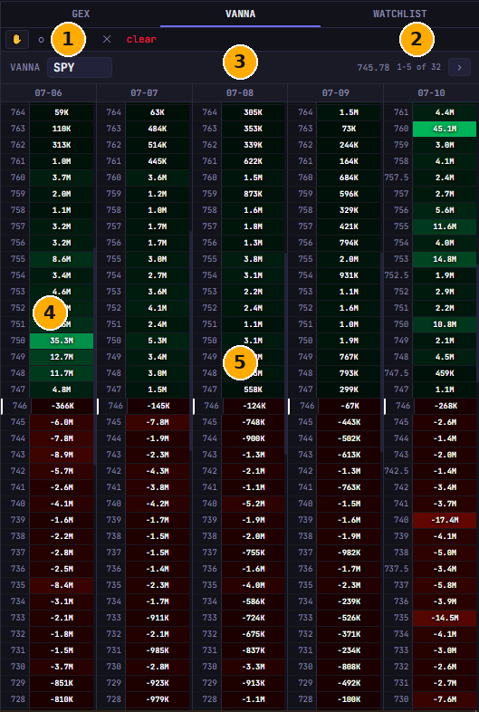
| # | Feature | What it does |
|---|---|---|
| 1 | Ticker Selector | Change which ticker's vanna table you're viewing, independent of the main chart. |
| 2 | Pagination | Vanna data spans many strikes — this shows which page you're on and lets you page through the rest. |
| 3 | Date Columns | Each column is a different expiration date, so you can compare vanna exposure across near-term vs. further-out options. |
| 4 | Largest Concentration | The brightest highlighted cell marks the single biggest vanna exposure currently in view. |
| 5 | Strike / Value Grid | Each row is a strike price; each cell shows vanna exposure at that strike for that expiration, shaded green (positive) or red (negative) by magnitude. |
GEX tells you how dealers will likely react to price moving. Vanna tells you how dealers will likely react to volatility moving. A stock sitting on a big GEX wall going into an earnings report or Fed day is worth watching from both angles — a sharp IV move that night can force vanna-driven hedging on top of whatever the price itself does the next morning.
Dark Pool Prints
Dark pools are private trading venues where large institutional block trades happen off the public exchanges. They're legal and regulated, but the trades are reported to the public tape with a delay, rather than appearing live like a normal exchange trade.
Toggling Dark Pool on draws glowing lines on the chart at price levels where large-notional block trades have printed recently. Larger trades glow brighter and get a bigger label; the label shows the dollar notional, how many trades bucketed at that price, and the most recent date.
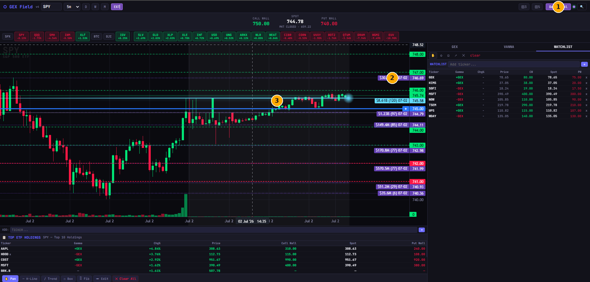
| # | Feature | What it does |
|---|---|---|
| 1 | Dark Pool Toggle | Click to turn dark pool prints on or off for this chart. |
| 2 | Notional Label | Each glowing level shows the dollar notional traded at that price, how many trades bucketed there in parentheses, and the most recent date. |
| 3 | Glow Line | The brighter and thicker the glow, the larger the trade — extends from the price level to the current candle. |
Trade Detail Popup
Click directly on any glowing dark pool line and a popup opens listing every individual trade bucketed into that price level — the exact price, trade date, and notional size for each one, sorted largest first. This works no matter which draw tool is currently selected.
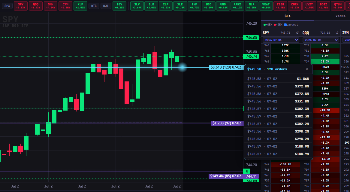
| # | Feature | What it does |
|---|---|---|
| 1 | Click to Inspect | Click anywhere along a dark pool glow line to open the popup for that price level. |
| 2 | Order List | Every individual trade bucketed into that level, sorted by notional size, largest first. |
| 3 | Close | Click the ✕, or click anywhere outside the popup, to close it. |
Dark pool prints show you where meaningful size has already traded, which can act as a reference level the same way a GEX wall does — but it's a record of past institutional activity, not a signal of what happens next.
Dark Pool Leaders
Dark Pool Leaders is a separate, market-wide view from the per-ticker Dark Pool prints above — instead of drawing levels on one chart, it groups today's off-exchange block activity by sector and ranks them, so you can see which corners of the market are seeing the heaviest off-exchange buying at a glance, rather than scanning one ticker at a time.
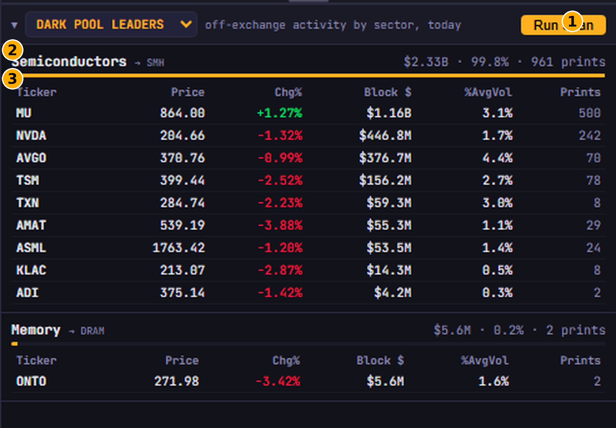
| # | Feature | What it does |
|---|---|---|
| 1 | Run Scan | Kicks off the scan across the sector-tagged universe. This is expensive to compute (one API call per ticker), so results are cached for about 90 seconds server-side — running it again immediately will often return the same numbers. |
| 2 | Sector Header | Each sector's total dollar volume in dark pool blocks today, its share of the whole market's dark pool total, and total print count. Click the sector name to jump straight to its representative ETF (shown next to the arrow). |
| 3 | Data Columns | Price and today's % change for context, Block $, %AvgVol, and Prints — see below for what each one actually means. |
Reading the Columns
Block $ is the total dollar value of block trades that cleared the minimum size threshold for that ticker today — the raw size of the money involved. On its own, a large number here doesn't tell you much.
%AvgVol is what actually makes Block $ meaningful: it expresses the shares traded in dark pool blocks as a percentage of that stock's own average daily volume. A $300M print in a name that trades $2B a day barely registers as a fraction of its normal activity; the same $300M in a name that trades $50M a day is a real event relative to what's typical for it. High Block $ with a low %AvgVol usually just reflects a heavily-traded mega-cap where big dollar figures are business as usual. Low(er) Block $ with a high %AvgVol is usually the more interesting read — it means a real chunk of that stock's typical day moved off-exchange in a name where that's not the norm.
Prints is the number of separate qualifying block trades, not one combined figure. A high print count suggests sustained, repeated institutional activity throughout the day; a single print is more likely one isolated block trade.
Dark pool prints aren't tagged with direction — a block trade crossing off-exchange isn't confirmed as buying or selling. Today's % change is the closest available proxy: high %AvgVol activity in a name that's also down on the day reads more like distribution; the same activity in a name that's up reads more like accumulation. But this is a pattern read, not a confirmed signal — dark pool prints can also reflect index rebalances, ETF creation/redemption baskets, or internal crosses unrelated to any directional bet. The clearest combination to watch for is high %AvgVol, a high print count, and a real price move on the day, together — a single print on an otherwise flat stock is much less meaningful on its own.
GEX Heatmaps
A single sector-grouped view of your whole scan universe's day, all at once — every ticker shown as its own tile, colored by today's % change, grouped under its sector so you can read market-wide strength and weakness at a glance instead of checking one ticker at a time. Open it from the GEX Heatmaps button in the top toolbar.
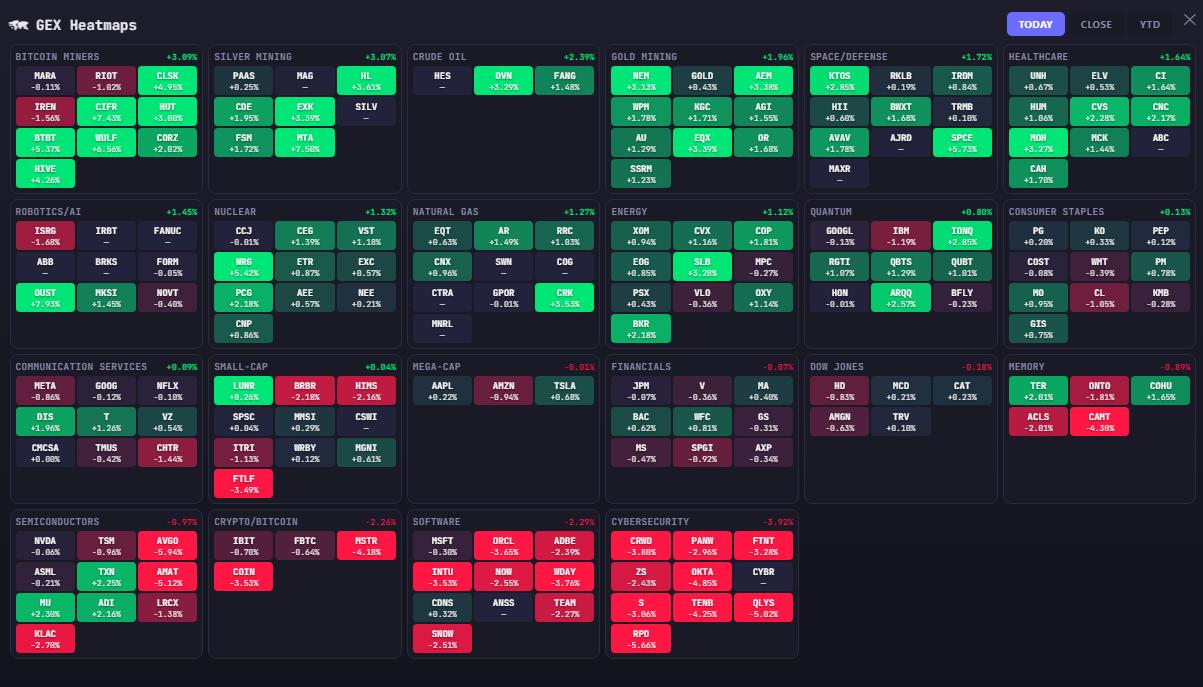
| # | Feature | What it does |
|---|---|---|
| 1 | Sector Header | Each sector's name and its own aggregate % change for the day. |
| 2 | Ticker Tile | One tile per ticker — click any tile to load it straight into the main chart. Color and shade reflect today's % change, brighter for a bigger move. |
This is a pure price/%-change view, not a GEX-by-strike map — despite the name, it's reading the same daily-performance data as the sector bar at the top of the main chart, just laid out as a full-screen grid instead of a single scrolling row.
Order Flow Spotlight
Alongside every candle sits a normal volume bar — but on today's candles specifically, that bar also doubles as an order-flow indicator. Real-time options order-flow alerts (sweeps, blocks, and splits) get bucketed into whichever candle they landed in, and any candle that had a genuinely large order lights up: the volume bar turns a brighter green or red, and a small colored dot appears just above it as a click target. Whether a candle lights up at all depends only on whether a large order happened during it — but the color itself (green vs. red) reflects the call/put split across every order in that candle, large or small, so it always matches what you'll see if you click through to the popup. A candle can still light up green even if puts outnumber calls among just the large orders, as long as calls win out once every order is counted.
Not to be confused with Volume Flow Finder further down this guide — that's a separate scanner (in the Watchlist tab) that checks the whole sector/ETF-holdings universe for large orders across ~200 tickers at once. This feature lives directly on whichever single chart you're currently viewing.
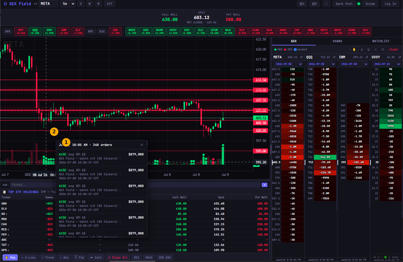
| # | Feature | What it does |
|---|---|---|
| 1 | Lit Volume Bar + Dot | A brighter green or red volume bar with a small dot above it means this candle had a large options order-flow alert. Bar height is still real share volume — the color/dot is a separate signal layered on top, not a change to the height itself. |
| 2 | Click to Inspect | Click anywhere in the volume-bar strip at the bottom of the chart (lit or not) to open a popup listing every order bucketed into that candle — strike, call/put, expiration, premium, and fill price, sorted largest first. |
There's no single fixed dollar threshold — what's large for a mega-cap like SPY or META isn't the same as what's large for a smaller, lower-priced name. Instead, each ticker's own order flow for the day is compared against itself: an order has to rank in roughly the top 15% of that specific ticker's alerts today to count as "large" and light up its candle. This means the bar for "large" naturally calibrates itself per ticker without needing to know its market cap or average volume ahead of time.
Highlighting is re-evaluated continuously, not locked in — a candle lights up when its order ranks in the current top ~15% for that ticker today, and if bigger orders arrive later and raise that bar, an earlier candle that no longer qualifies will un-light. This is a live, current-standing view of today's biggest flow, not a running list of everything that was ever briefly "large."
Order flow is tracked and clickable for a rolling 24 hours — not just until market close. That means you can review today's session that evening, or first thing before the next open, and still click through to see the individual orders behind a lit candle. Once a candle passes the 24-hour mark, clicking it will say order flow is no longer tracked for it.
This extends to the Daily chart only — Weekly and Monthly candles span too many sessions for the 24-hour retention window to meaningfully represent, so highlighting stays off on those. On Daily, only today's currently-forming candle can ever light up (there's no long-term historical archive of past days' order flow to draw from), so a prior day's Daily candle will never highlight and clicking it will say order flow isn't tracked that far back. When you click today's Daily candle, the popup shows a bullish-vs-bearish summary (order count and total premium on each side) instead of a scrollable list of every individual order — a full day's worth of orders can easily run into the thousands, and a breakdown of the overall tilt is more useful at that zoom level than scrolling through all of them one by one.
Daily Summary Popup
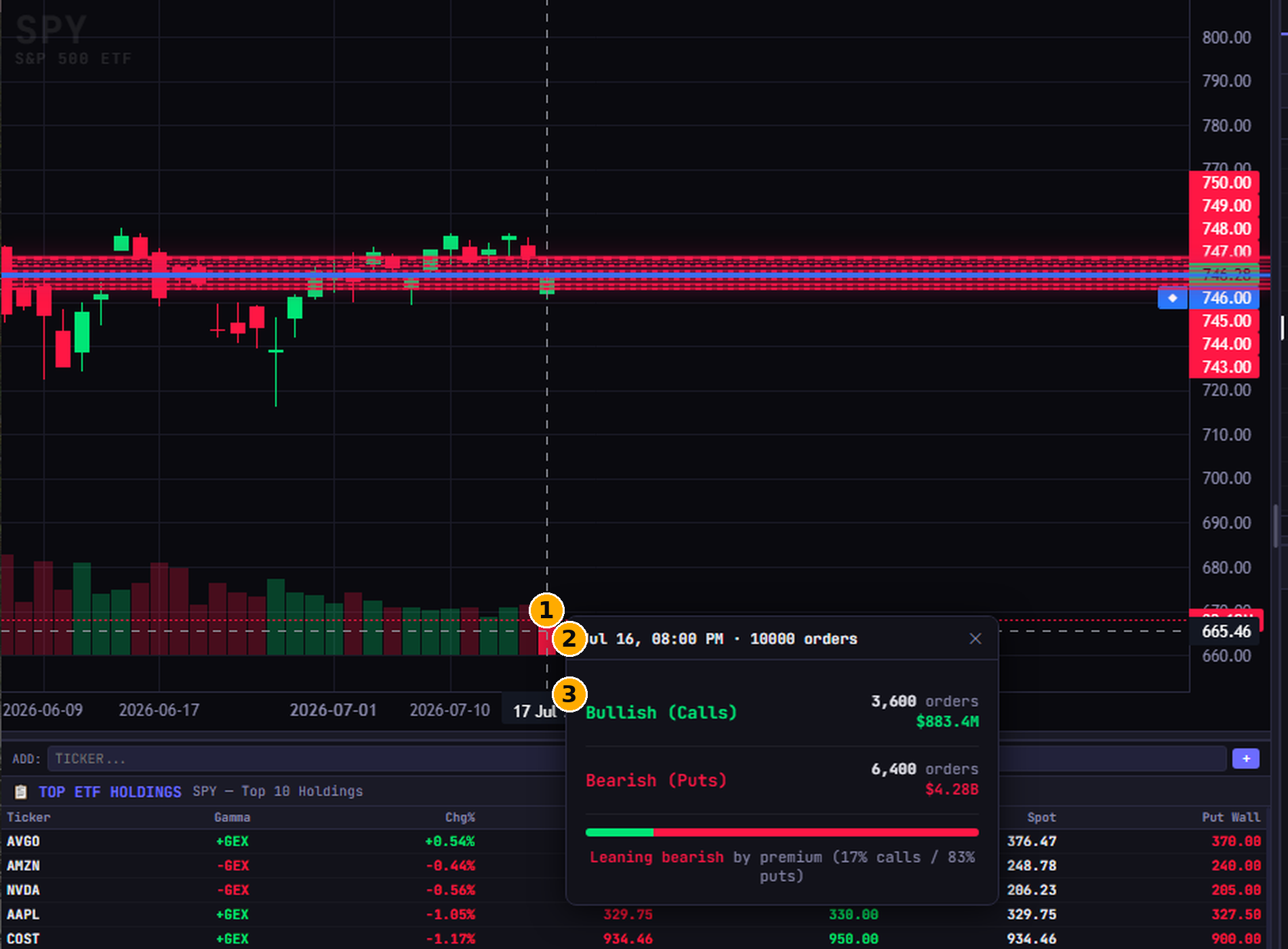
| # | Feature | What it does |
|---|---|---|
| 1 | Lit Daily Candle | Today's still-forming Daily candle, lit the same way an intraday candle would be — brighter red here means the day's flow is net put-heavy so far. |
| 2 | Order Count Header | Total number of orders bucketed into today so far — same header format as the intraday popup. |
| 3 | Bullish/Bearish Breakdown | Order count and total premium on each side, plus a proportional bar and a one-line "leaning bullish/bearish by premium" readout. |
Order flow tracking only runs for a specific universe of tickers, not literally every stock or ETF — by default a curated list of major indices, sector ETFs, and mega-caps (SPY, QQQ, IWM, sector ETFs, AAPL/MSFT/NVDA/etc.), expanded to the full ~200+ ticker scan universe once Sync Alert Coverage has been run. A ticker outside that universe was simply never being watched server-side, so its candles will never light up and clicking one will show no orders — that's a coverage gap, not a "nothing happened" result.
Within a tracked ticker, clicking works on any candle, lit or not — lighting only means "this candle had an order large enough to rank in the current top ~15%." A candle that isn't lit can still have real, smaller orders behind it, and clicking it shows whatever's actually there rather than being gated on the highlight.
The Strat (Candle Classification)
The Strat is a candle-classification framework — every completed candle is compared only to the one before it and sorted into one of three types based purely on whether it broke that prior candle's high, low, both, or neither. It has nothing to do with options positioning; it's read directly off price action, the same way it would be on any chart. The Strat button in the drawing toolbar turns the whole system on or off at once.
| Type | Name | What it means |
|---|---|---|
| 1 | Inside Bar | This candle's high is below the prior candle's high, and its low is above the prior candle's low — the whole bar is contained inside the previous one. Marked with a plain "1". |
| 2 | Directional Bar | This candle broke the prior candle's high or low, but not both. An up arrow marks a break of the prior high; a down arrow marks a break of the prior low. Marked with a "2". |
| 3 | Outside Bar | This candle broke both the prior candle's high and low — a full engulf of the previous bar's range. Marked with a "3". |
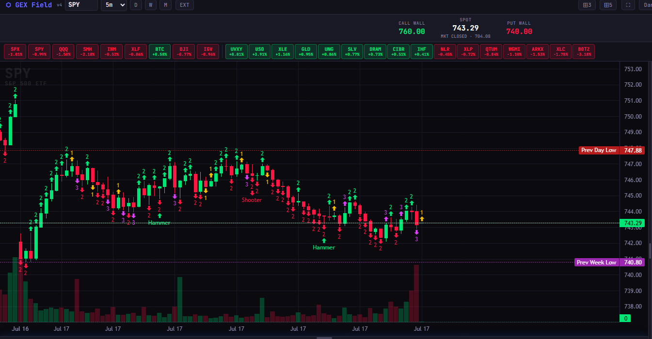
Because every classification only ever looks one candle back, chaining several of them together in sequence (reading right to left) is what defines a named "combo" setup — a 2-1-2, a 3-2-2, and so on. When enabled, GEX Field labels these combos directly on the chart as they complete.
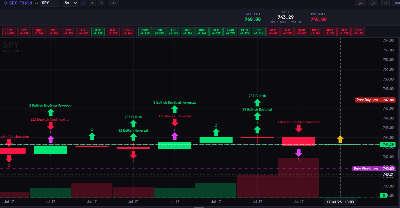
Two additional single-candle signals layer on top of the 1/2/3 classification, independent of it: a Shooter is a candle whose open and close both sit in the bottom quarter of its own high-low range (a long upper wick, bearish rejection of higher prices); a Hammer is the mirror image — open and close both in the top quarter of the range (a long lower wick, bullish rejection of lower prices). Both use the source script's standard 75% wick threshold.
Layer Management
The small ☰ button next to the Strat toggle opens a panel that turns each layer on or off independently — plain 1/2/3 Numbers/Arrows, Combo Labels, Shooter/Hammer, Prev Day/Week Lines, and Pre-Market High/Low — without needing a separate toolbar button for every one of them. Prev Day/Week Lines draw the prior day's and prior week's high/low directly on the chart as reference levels, fetched independently of whatever timeframe you're currently viewing, so they stay meaningful even on a 5-minute chart. Pre-Market High/Low draws today's pre-market session range (off by default) — it's a snapshot taken when the layer loads, not a running live update, so if you're watching during an active pre-market session the lines catch up next time you switch tickers or reload rather than ticking live.
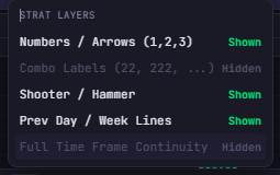
The Strat is a purely descriptive price-action framework, same as everything else in this guide — a candle sequence completing a named combo is not a signal to enter or exit a trade, it's a pattern label. Treat it the same way you'd treat any other technical read: one input among many, not a standalone call to action.
Strat S/R
A drawing tool, not a toggle — click Strat S/R in the drawing toolbar, then click anywhere on the chart to draw a one-sided horizontal line from that price out to the right edge, automatically tagged with whatever timeframe the chart was on when you drew it. Meant for marking a level you're tracking as potential support or resistance going forward, distinct from the chart's own GEX-derived lines.
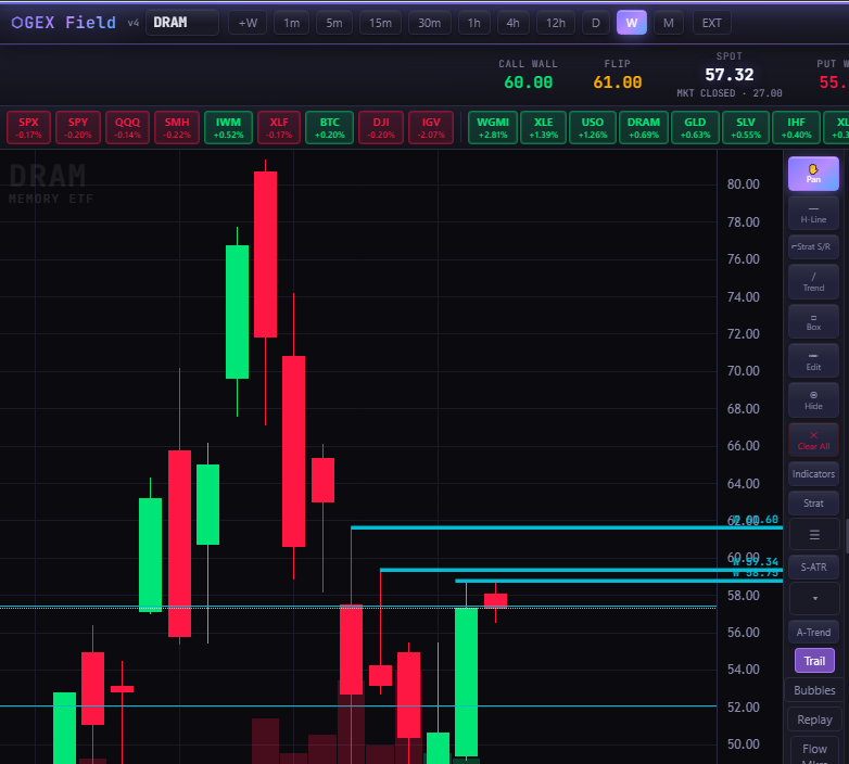
Like every other drawing tool, S/R lines are yours — they persist on that ticker/timeframe until you clear them, and don't come from any GEX or options data. It's a plain price-action marking tool, same category as the trend line and horizontal line tools right next to it.
Adaptive Trendlines (A-Trend)
Turns on an auto-detected support or resistance trendline for whatever's charted — no manual drawing required. It finds the deepest low over roughly the last 40 sessions as one anchor, then the most recent confirmed higher-low (or lower-high, for a downtrend) pullback as the second anchor, and draws the line through them, extrapolated to today. Toggle it with the A-Trend button in the drawing toolbar.
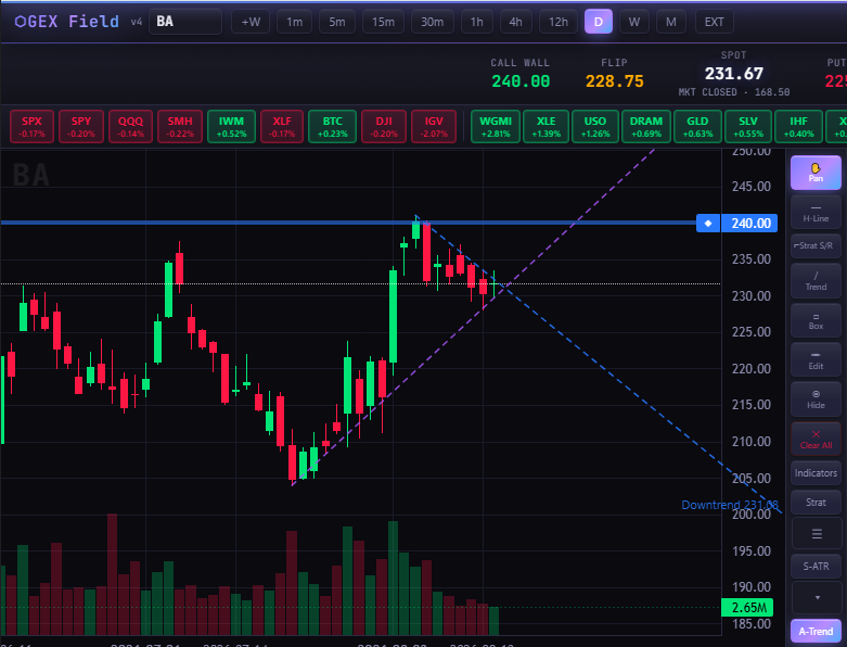
This is the exact same trendline logic the Uptrend Entries scanner runs across the whole universe automatically — turning A-Trend on for a single ticker lets you see that same read directly on the chart, drawn live, rather than only as a scanner result.
Volume Profile
A vertical histogram along the right edge of the chart — one horizontal bar per price level, length proportional to that level's share of the volume currently in view. Recomputes as you pan or zoom, so it always reflects whatever stretch of the chart you're actually looking at, not a fixed full-day total. The single highest-volume level (the point of control) is picked out in a brighter color. Toggle it with the Vol Profile button in the chart toolbar.
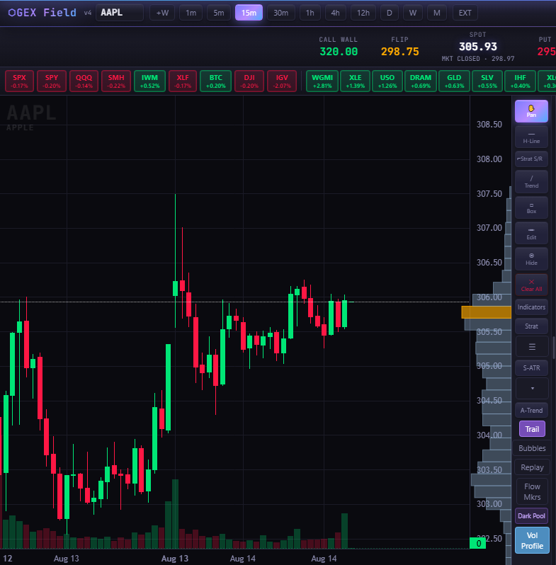
Unlike most of the chart toggles in this guide, Volume Profile has no tier gate at all — it's available to every visitor, signed in or not.
Extended Hours (Pre-Market & After-Hours)
By default, the chart only shows regular trading hours (9:30 AM – 4:00 PM Eastern). Turning on the EXT toggle adds pre-market and after-hours candles to the chart, and shades those stretches of the chart with a subtle gray background so you can tell at a glance which candles happened outside regular hours.
Pre-market and after-hours trading has much thinner liquidity than the regular session — wider spreads, fewer participants, and price moves that can look dramatic on a small amount of volume. Read extended-hours price action with that in mind.
Multi-Chart View
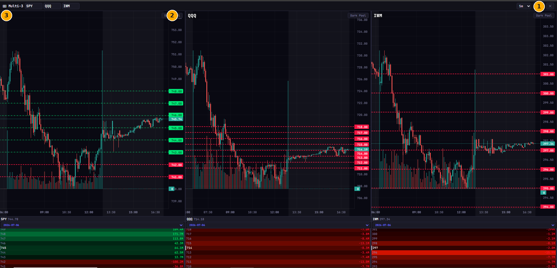
Multi-Chart View lets you watch several tickers side by side, each with its own GEX levels, dark pool toggle, and mini gamma-exposure table underneath. Choose a 3-panel or 5-panel layout from the buttons in the main toolbar, and arrange the panels horizontally or vertically depending on your screen.
Horizontal Layout
Vertical Layout
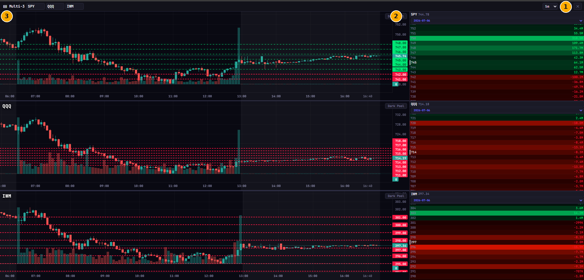
| # | Feature | What it does |
|---|---|---|
| 1 | Layout Toggle | Switch the panel arrangement between horizontal (side by side) and vertical (stacked). |
| 2 | Per-Panel Dark Pool Toggle | Each panel has its own independent Dark Pool on/off switch. |
| 3 | Panel Ticker Label | The ticker currently loaded in that specific panel — type a new one to change it independently of the other panels. |
Multi-5 works exactly the same way with two additional panels — same layout toggle, same independent per-panel controls, just more tickers visible at once.
The Watchlist Tab
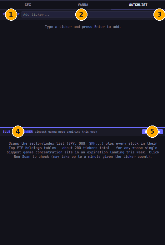
The WATCHLIST tab holds your own personal list of tickers, independent of whatever's loaded on the main chart — a quick way to scan several names for who's sitting near a major gamma level without switching the main chart.
The tab is split into two halves: your personal watchlist on top, and the Blue Node Finder scanner below (see the next section). Click either half's header to collapse it — the other half expands to fill the freed-up space, which is especially useful on a smaller phone screen.
| # | Feature | What it does |
|---|---|---|
| 1 | Watchlist Header | Click anywhere on this bar to collapse/expand the watchlist half — the chevron shows current state. |
| 2 | Add Ticker | Type a ticker and press Enter to add it to your personal watchlist. Once added, each row shows Gamma regime (+GEX/−GEX), % change, Price, Call Wall, Spot, and Put Wall. |
| 3 | Add Button | Same as pressing Enter — adds whatever's typed in the input. |
Each row also has a Tag column — click it (or the "+ tag" placeholder on an untagged row) to type any free-text label, like "Long" or "Watching," to mark what that ticker actually is to you. A TAG dropdown above the table filters the whole list down to just one tag, "Untagged," or back to "All" — handy once a watchlist mixes long positions in with names you're just tracking for the week. Tags sync to your account alongside the rest of your watchlist, so they show up the same way on your phone and your desktop.
Blue Node Finder
Below your personal watchlist sits the Blue Node Finder — a scanner that checks roughly 200 tickers (the sector/index list plus every stock in their Top ETF Holdings tables, including anything you've manually added) for a specific pattern: which ones currently have their single biggest gamma concentration sitting in an expiration that lands within the current week.
Sign doesn't matter here — a match can be the ticker's biggest +GEX or −GEX node. This is purely about timing: is the largest concentration of gamma about to expire soon, which is often when dealer hedging behavior around that level matters most.
| # | Feature | What it does |
|---|---|---|
| 4 | Finder Header | Click anywhere on this bar to collapse/expand the finder half, same as the watchlist header above. |
| 5 | Run Scan | Kicks off the scan. Given the ticker count, a full run can take up to about a minute. Results show each match's spot price, node strike, expiration date, and signed gamma value — click any row to load that ticker into the main chart. |
"This week" means the standard Monday-through-Friday trading week. If today is a Friday, the week has already ended for scanning purposes — try again after the weekend and the window rolls forward to the new week automatically.
Volume Flow Finder
Same split panel, same ~200-ticker universe as Blue Node Finder above (sector/index list plus every stock in their Top ETF Holdings tables, including anything you've manually added) — but instead of scanning for gamma timing, this mode scans for today's options order-flow alerts (sweeps, blocks, and splits) across that entire universe at once, sorted by total premium.
Not to be confused with Order Flow Spotlight above — that lights up order flow directly on whichever single chart you're currently viewing. Volume Flow Finder instead sweeps the whole universe in one pass, so you can find which tickers have large flow today without opening each chart individually.
| # | Feature | What it does |
|---|---|---|
| 1 | Mode Dropdown | Switch this panel between BLUE NODE FINDER and LARGE ORDER FLOW — same header bar, same Run Scan button, different scan underneath. |
| 2 | Run Scan | Kicks off the scan across the full universe. Results list each match's ticker, strike, call/put, expiration, number of orders, and total premium — sorted largest premium first. Click any row to load that ticker into the main chart. |
| 3 | Sync Alert Coverage | Makes sure the underlying options order-flow feed is actually watching every ticker in the current scan universe, creating or updating alert coverage on the account behind the scenes as needed. Only runs when you click it and confirm — never automatically. |
The scan can only find flow for tickers it's actually watching — if you've recently added new tickers to an ETF's Top Holdings table (or the sector list has changed), run Sync Alert Coverage first so the scan has something to find.
Strat Scanner
Same split panel and mode dropdown as Blue Node Finder and Volume Flow Finder above, and the same ~200-ticker universe — but this mode scans for seven named Strat combo setups completing right now, across three timeframes at once: 15m, 4H, and Daily. Not 12H — for a ~6.5 hour trading session, a 12-hour bar would just be the whole day again under a different label, so it's skipped as redundant.
| Pattern | What it is |
|---|---|
| 2-1-2 Reversal | A directional bar, then an inside bar, then a directional bar breaking the opposite way — the classic Strat reversal shape. |
| 3-1-2 Reversal | An outside bar, then an inside bar, then a directional bar — same reversal idea, with an outside bar setting it up instead of a second directional bar. |
| 3-2-2 Reversal | An outside bar, then a directional bar, then a directional bar breaking the opposite way. |
| 2-3-2 | A variant not in the original Strat script — the same shape as a 2-1-2 but with an outside bar sandwiched in instead of an inside bar. |
| Failed 2U / Failed 2D | A directional bar that breaks the prior candle's high (or low) intrabar, but closes back inside the range it just broke out of — the breakout tagged the level and failed to hold it. Failed 2U skews bearish from here; Failed 2D skews bullish. |
| 3-1-1 Coil | An outside bar followed by two consecutive inside bars — the range is compressing. Shown amber rather than green/red since there's no directional lean yet; it's a "watch this one, the next bar's break either way is the real signal" flag, not a reversal call. |
| # | Feature | What it does |
|---|---|---|
| 1 | Mode Dropdown | Select STRAT SCANNER from the same dropdown used for Blue Node Finder, Large Order Flow, and Dark Pool Leaders. |
| 2 | Run Scan | Kicks off the scan across the full universe on all three timeframes. Results list each match's ticker, timeframe, the specific pattern found (colored green for a bullish setup, red for bearish, amber for a neutral 3-1-1 coil), and current spot price. Click any row to load that ticker into the main chart. |
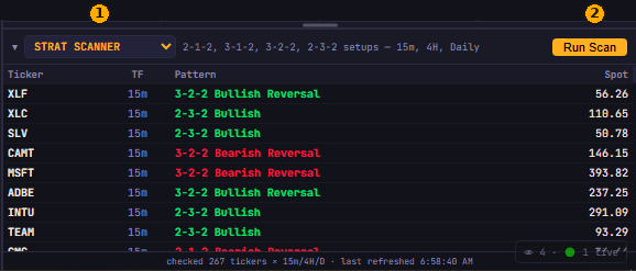
Once results come back, a Pattern dropdown sits above the table — pick a specific pattern (2-1-2, 3-1-2, 3-2-2, 2-3-2, Failed 2U, Failed 2D, or 3-1-1) to isolate the list down to just that shape (both its bullish and bearish version, where it has one), or leave it on All Patterns to see everything a scan found.
Unlike some of the other scan modes still in host-only testing, Strat Scanner is included with every Membership.
Pre-Market Scanner
Reads SPY/QQQ/IWM/DJI's own pre-market gap for an overall sentiment call, backed up by breadth across the scan universe, then breaks it down by sector (average gap across every name in that sector, not just its biggest movers) so sector-wide strength or weakness is visible at a glance — followed by a list of which individual names are actually gapping up, each with its own sector and nearest-expiration blue node. Reachable from the WATCHLIST tab's scanner picker.
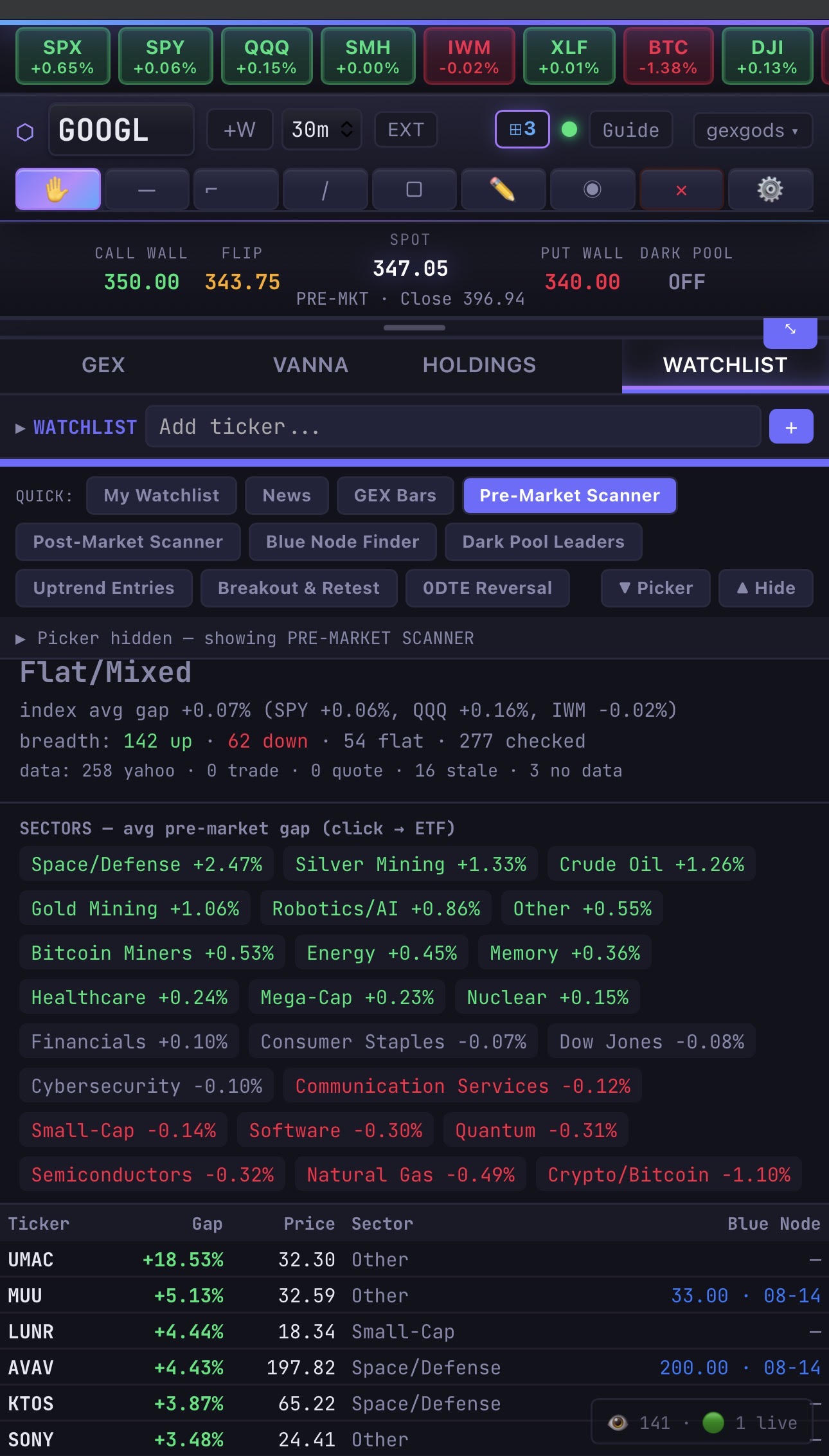
| # | Feature | What it does |
|---|---|---|
| 1 | Sentiment Call | An overall read ("Flat/Mixed", "Bullish," etc.) driven by the major index ETFs' own gap, plus the index average gap and breadth (how many names are up vs. down vs. flat) across the whole scan universe. |
| 2 | Sector Tiles | Each sector's average pre-market gap — click any tile to jump straight to its representative ETF. |
| 3 | Gapper List | Individual tickers gapping, sorted largest first — ticker, gap %, price, sector, and nearest-expiration blue node (with the date it was recorded) where one applies. |
This reads the pre-market session specifically — outside that window (or once the regular session gets underway) the gap it's measuring is no longer the relevant number, so run it during the actual pre-market hours it's meant for.
Post-Market Scanner
Same idea as Pre-Market Scanner above — index-gap-driven sentiment, sector breadth, a gapper list with each name's blue node — but for the after-hours window instead, measuring the move against today's regular-session close rather than yesterday's close. Reachable from the same scanner picker.
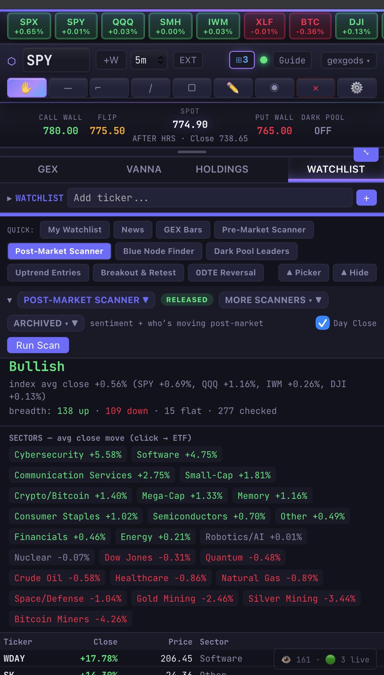
The Day Close toggle switches the whole panel between two different questions: off, it tracks the live after-hours move as it happens; on, it freezes on how the regular session itself closed, before any after-hours activity. Each keeps its own separate results, so switching back and forth never loses either one.
Top Gainers
Today's biggest movers across the scan universe, up and down, refreshed automatically on an interval you can set — no need to click Run Scan repeatedly to keep it current.
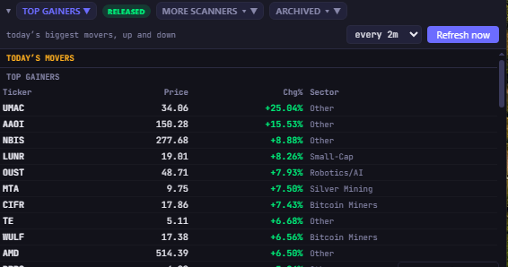
| # | Feature | What it does |
|---|---|---|
| 1 | Auto-Refresh Interval | Choose how often the scan re-runs on its own — every 30s up to every 5 minutes. |
| 2 | Refresh Now | Runs an immediate check without waiting for the next auto-refresh. |
| 3 | Results | Ticker, price, % change, and sector — Top Gainers and Top Losers listed separately, each sorted by move size. |
Uptrend Entries
Scans the universe for tickers with a fresh, confirmed uptrend that's currently pulling back to test its own trendline as support — the same trendline logic behind Adaptive Trendlines, run across every ticker automatically instead of one at a time. A match means price is sitting right at (within about 2%, or up to 1% already below) its own uptrend line right now.
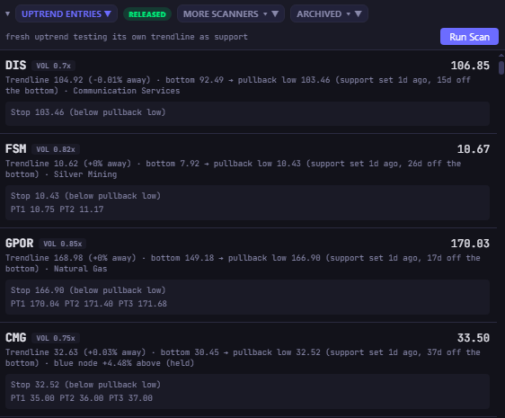
| # | Feature | What it does |
|---|---|---|
| 1 | Ticker & Vol | The ticker and its volume today relative to its own trailing average — a volume multiple below 1.0x means today is quieter than usual for that name. |
| 2 | Trendline Detail | The trendline's current price and % distance from it, where the trend's bottom and pullback low were set and how long ago, and — when it applies — a note that a real, held blue node sits above with room to run (see GEX Trail above for what "held" means here). |
| 3 | Stop / Targets | A suggested stop below the pullback low, plus price targets where shown. |
This surfaces the setup, not a signal to enter — a pullback testing its trendline can just as easily break down through it as bounce. Treat it as a watchlist of where to look, same as every other scanner in this guide.
Flow Markers
Labels a large individual options order directly on the candle where it happened — something like "$5.5M Call Sweep" — right on the chart itself, built from the same live order-flow data Order Flow Spotlight and Volume Flow Finder already use. Toggle it with the Flow Mkrs button in the chart toolbar (or from the account menu on mobile).
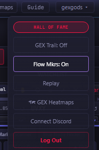
Like Order Flow Spotlight, labels only appear where a genuinely large order actually landed — a quiet session on a lightly-traded name may show no markers at all, which reflects real order flow, not a broken toggle.
Unusual Flow
Ranks tickers across the whole scan universe by today's options flow concentration per strike — premium size, sweep count, and proximity to that ticker's own Call/Put Wall. There's no open-interest data available from the underlying data source, so this is a notability read (where the money's actually landing today) rather than a directional call. Reachable from the WATCHLIST tab's scanner picker.
Member Reviews
What actual members are saying — every review below was submitted by a signed-in member and approved by the GEX Field team before appearing here. Signed in already? Leave your own from the account menu ("⭐ Leave a Review") inside the app.
Loading reviews…
Quick Reference Glossary
- GEX (Gamma Exposure) — a measure of how much stock market makers need to buy or sell to stay hedged as price moves, aggregated across all outstanding options at each strike.
- Vanna — a measure of how market makers' hedges shift when implied volatility changes, even without the stock price moving.
- Call Wall — the nearest major positive-GEX strike above the current price; often acts as resistance.
- Put Wall — the nearest major negative-GEX strike below the current price; often acts as support, though it can also break sharply.
- Zero Gamma / Gamma Flip — the price level where aggregate dealer gamma crosses from positive to negative.
- Dark Pool Print — a large, off-exchange block trade reported to the public tape with a delay.
- Spot — the current, live price of the underlying.
- EXT (Extended Hours) — pre-market and after-hours trading, shown with a gray-shaded background when enabled.
Remember: everything in this guide and everything on the dashboard describes current market positioning. None of it is a prediction or a recommendation — always do your own thinking before acting on anything you see here.